Crafting a holistic skincare brand that nods to apothecary heritage while speaking to today’s wellness audience.
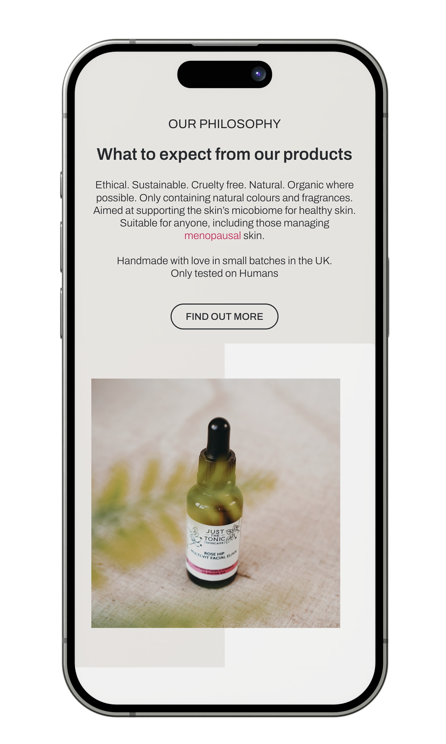
Just The Tonic isn’t just skincare, it’s a ritual rooted in tradition with a modern twist. Drawing from Victorian apothecaries, botanical remedies, and the idea of healing with intention, the brand’s identity needed to feel both premium and authentic.
The founder came to me with innovative formulas but no visual voice. The challenge: stand out in a saturated beauty market, meet regulatory packaging demands, and capture that balance between old-world charm and fresh, modern elegance.
What I did:
Positioning: Mapped competitor aesthetics and customer expectations in holistic skincare; identified gaps where authenticity and botanical storytelling could shine.
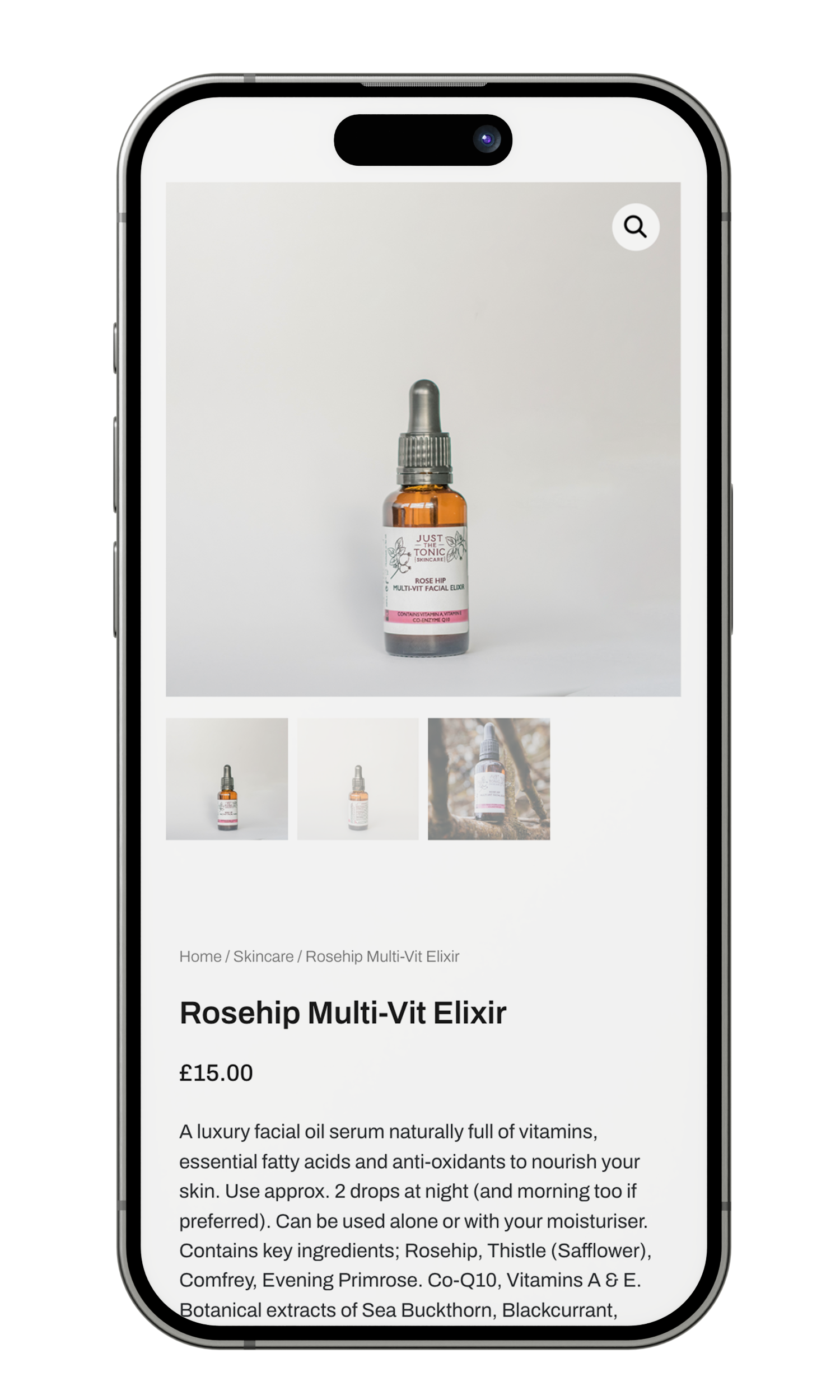
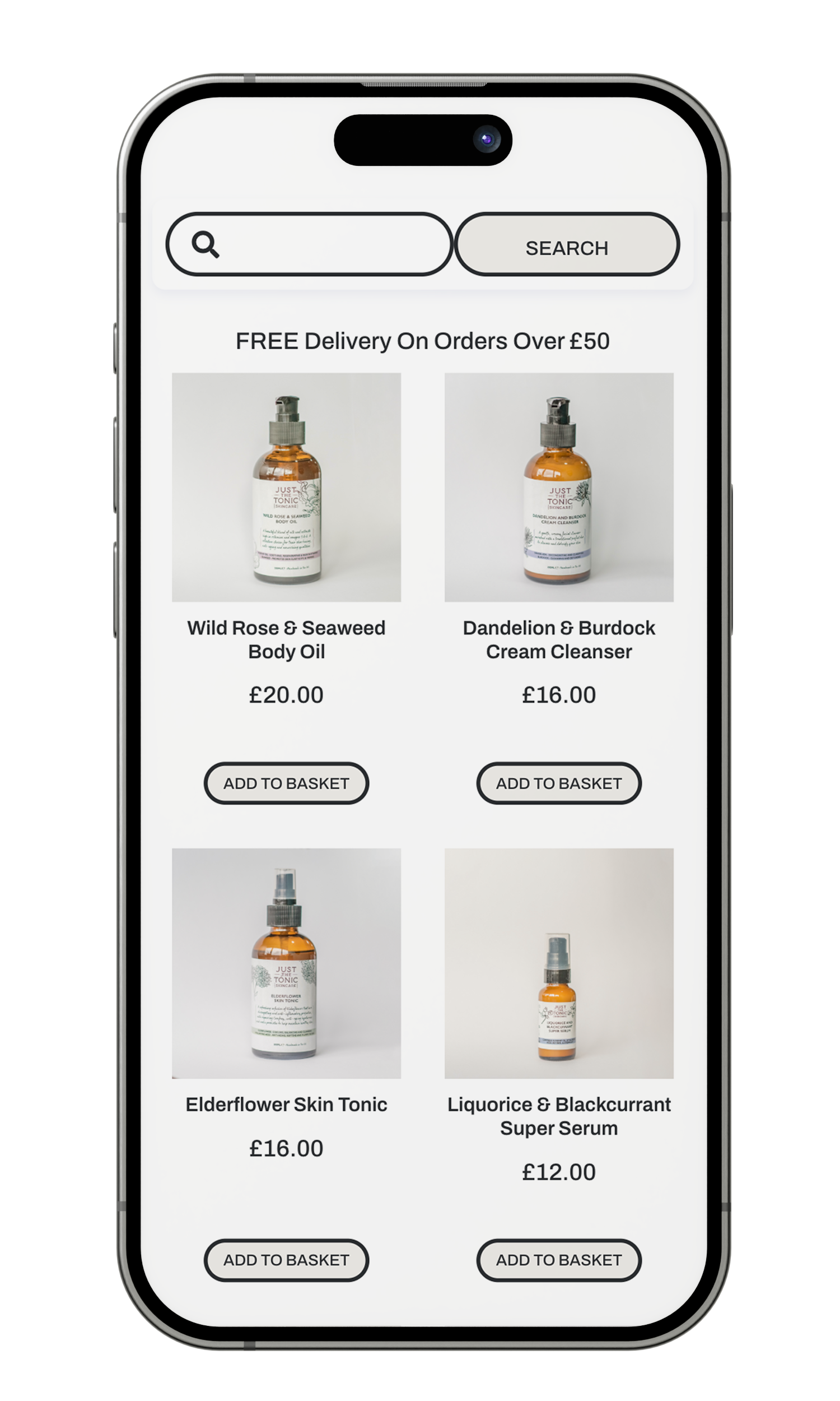
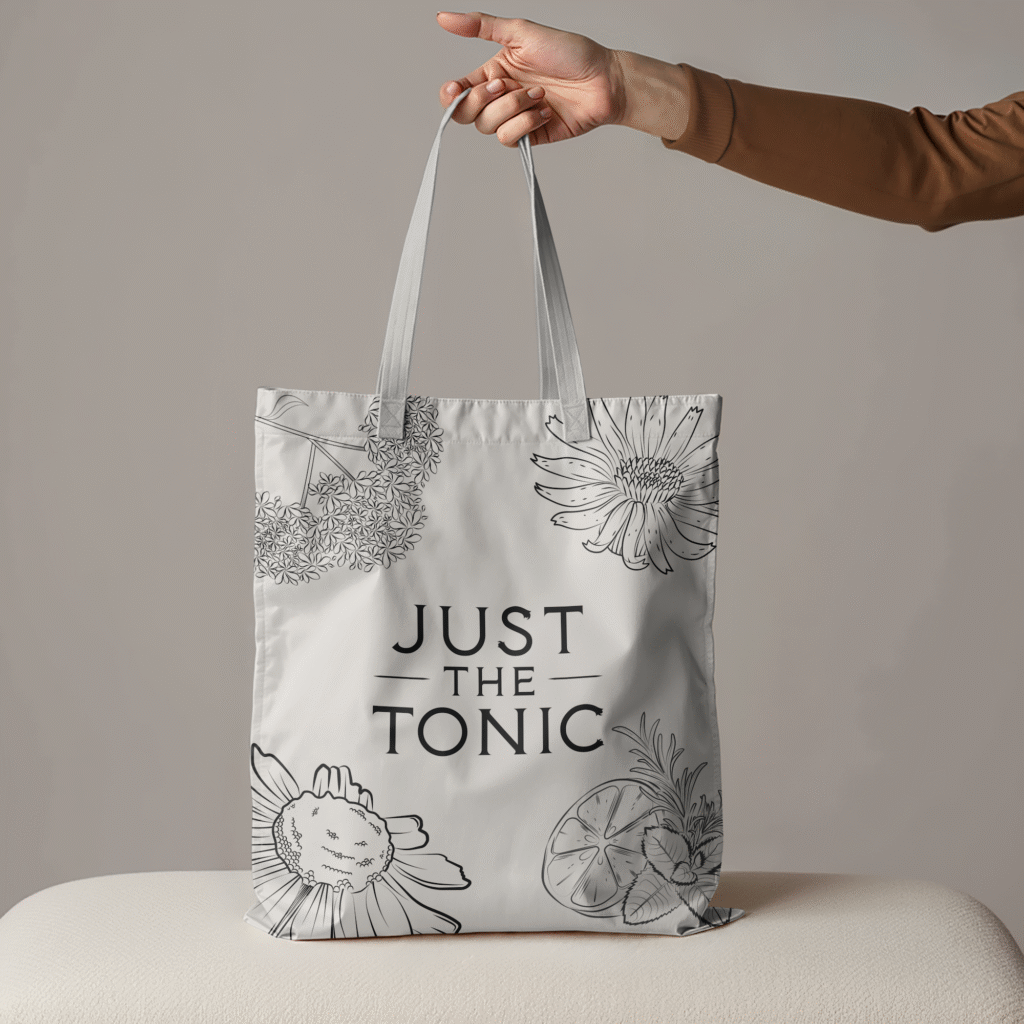
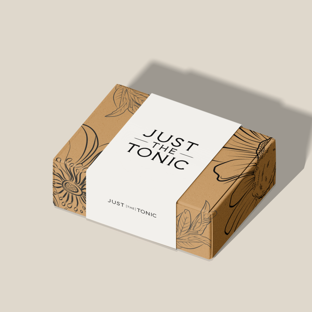
Visual Identity & Packaging: Designed illustrative elements (flora/flora motifs), colour bands for product variations, packaging that feels premium without losing warmth or approachability.
Digital & Product Photography:
Created e-commerce visuals that draw people in, highlighting texture, care rituals, and product effects.
Why It matters: In beauty, heritage is everywhere. But what’s rare is doing heritage with intention, ensuring each design choice speaks to modern wellness and trust. Just The Tonic’s identity feels confident, kind, and clear. Inviting people into skincare rituals, not just products.
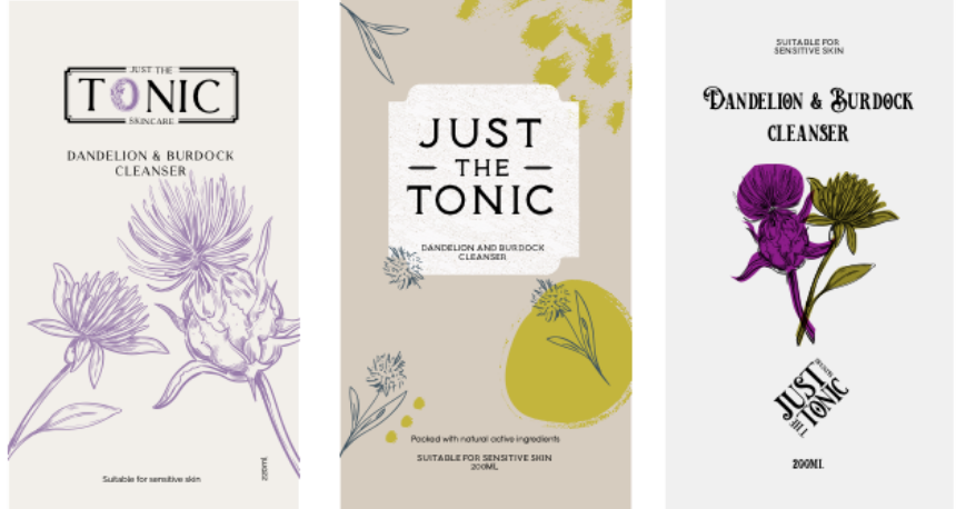
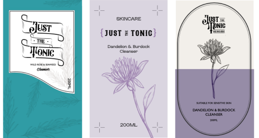
Branding Concepts
Finding the balance between oldy-wordly apothecary labels, without looking too homemade and having colours to signify certain ingredients to support the full range.
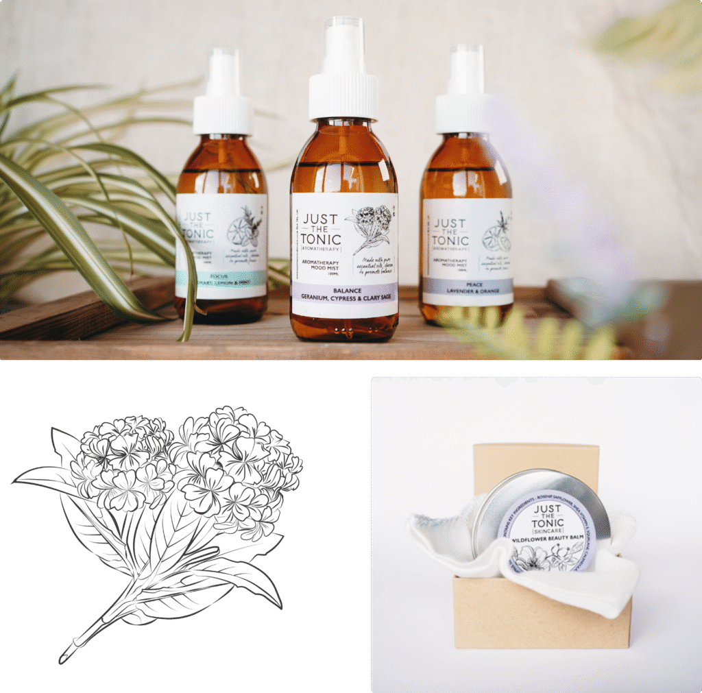
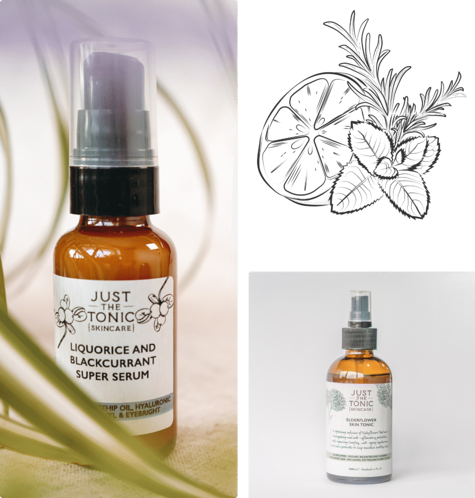
Final Outcome
Identifiable colour band labelling with a nod to tradition, whilst still looking fresh.